
If you have a business, having a website is essential to establish a strong digital presence. Simply having a website is not enough. In the digital world, where content is everywhere, you have to find a way to stand out from the crowd. Hence, having a responsive website is not only a must but essential. In this article, we will discuss why having a responsive website design is important and how it can benefit your business.
What is Responsive Website Design?
Responsive website design is an approach to web design that adapts the website layout and content to different screen sizes and devices used to view the site. This means that whether the user is visiting your website from a desktop, tablet, or smartphone, they will view the website in an optimized manner. Responsive design in websites has become increasingly important, given that many people have access to the internet from their mobile devices.
Why Responsive Website Design Matters
As a lot of individuals heavily rely on mobile devices, websites need to adapt as well to various screen sizes. These are the several factors as to why having a responsive website matters:
- Improved User Experience: One of the primary reasons why responsive website design matters is that it provides users with a better overall experience. A responsive website ensures that your content is easy to read and navigate, regardless of the device being used.
- Increased Mobile Traffic: With the increasing use of smartphones and tablets, more and more people are accessing the internet on mobile devices. By having a responsive website, you can tap into this growing mobile audience and ensure that your website looks great on any device.
- Higher Conversion Rates: A responsive website can lead to higher conversion rates. When users have a positive experience on your website, they are more likely to engage with your content and take the desired action, whether that’s making a purchase, filling out a contact form, or signing up for a newsletter.
- Improved SEO: Responsive website design can also have a positive impact on your search engine rankings. Google has stated that responsive design is its recommended mobile configuration, and having a responsive website can improve your site’s visibility in search engine results pages (SERPs).
- Cost-Effectiveness: While initially, the cost of developing a responsive website may be higher than that of a traditional website, in the long run, it can be more cost-effective. A responsive website eliminates the need for a separate mobile site, saving you time and money on maintenance and updates.
- Enhanced Brand Reputation: A responsive website demonstrates that your business is modern, professional, and customer-focused. This can enhance your brand’s reputation and make it more likely that visitors will trust and engage with your brand.
- Future-Proofing Your Website: As new devices with varying screen sizes are introduced to the market, having a responsive website ensures that your site will remain functional and attractive across all devices, without the need for constant updates or redesigns.

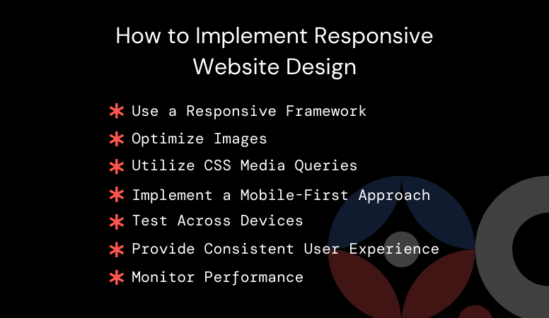
How to Implement Responsive Website Design
The goal of a responsive website is to provide a seamless experience across all devices making sure that the website is easy to navigate, looks pleasant and functional on any screen sizes. To be able to achieve this, designers and developers uses a combination of grids, images and CSS media queries to adjust the website in order to fit to the screen of different devices. Here are the ways on how to implement this:
- Use a Responsive Framework: When building your website, use a responsive framework such as Bootstrap or Foundation. These frameworks provide a set of tools and templates that make it easier to create a responsive design.
- Optimize Images: Optimize images for the web to ensure fast loading times on mobile devices. Use tools like Adobe Photoshop or online image compressors to reduce file sizes without compromising quality.
- Utilize CSS Media Queries: CSS media queries allow you to apply different styles to different devices based on their screen size, orientation, and resolution. Use media queries to create a responsive layout that adjusts to fit the screen size of the device.
- Implement a Mobile-First Approach: When designing your website, start with the mobile version first and then scale up to larger screens. This ensures that your website is optimized for mobile users, who are often the largest segment of your audience.
- Test Across Devices: Before launching your website, test it across different devices to ensure that it looks and functions correctly on each one. There are several online tools available that can help you test your website’s responsiveness.
- Provide Consistent User Experience: Ensure that the user experience remains consistent across all devices. This includes maintaining consistent branding, navigation, and content presentation.
- Monitor Performance: Regularly monitor your website’s performance on different devices and make adjustments as needed to ensure optimal performance.
In summary, making your website responsive is essential to succeeding online. It provides a better user experience, increases traffic, improves SEO, and can lead to higher conversion rates. Implementing these responsive design principles will ensure that your website performs well across different devices, which can help you reach a wider audience and achieve your business goals.
Get the help you need to turn your website into a responsive website.
Are you having trouble making your website responsive? Book a call with us, and let us help you with your website.